


Interactive web app with 60+ youth-written books
Novelly
P R O J E C T G O A L S
Novelly is an EdTech company with a web app that features 60+ youth-written stories on social issues
Increase community engagement: get more readers to come to read, stay on the site for longer
Make web app more interactive: create ways to make the site more interactive through visuals, text, and call to action
Notify users: let users viewing on mobile know that the community page is not available using clear and concise writing
Responsibilities
Surveys
User Interviews
Research Synthesis
Persona
Prototype
Usability tests
Role
UX Designer
+ Researcher
Timeline
3 weeks
P R O B L E MAfter discovery, we uncovered that users need a simple way to read on the go because they want to fit reading into their busy schedule
S O L U T I O NEase of Reading Access is key
I N T E R V I E W S
I’ve conducted 6 user interviews to determine what the problem with the sign-up flow was. I conducted interviews with users that
ages 13-21 teen girls who like to read ebooks
teen girls who have an interest in reading about social issues
like reading as an interest
We asked them questions about their reading habits and preferences. Questions regarding their device preference when reading, challenges they face when looking for new books, and their interest in reading books about social issues were used to understand users better. These questions helped us get detailed insights into the readers' habits and preferences. Because of this, I’ve gathered valuable insights into users’ problems and concerns.
R E S E A R C H S Y NT H E S I S
T H E M A I N I N S I G H T
None of the previous apps my users used worked due to a lack of enough personalization.
Based on trends in the affinity map, I noticed that if there is no personalization and recommendations for books to read, motivation to read will cease to exist and distractions will slowly take over.
Team
Seyoung
William


C O M P E T I T I V E A N A L Y S I S

The competition had no recommendations aspect
While keeping the above results in mind, I analyzed the 3 most popular web apps in the ebook/ reading sites. I found that almost none of them had the aspect of recommendations to help the user read more. This then became my opportunity for a solution.

P E R S O N A: T H E A V I D R E A D E R Betty the Bookworm
is a high school student who needs a simple way to read on the go because she wants to fit reading into her busy schedule
We created one persona based on our research synthesis. Betty the Bookworm is our primary persona and represents the female teen Novelly is hoping to reach and build a positive experience for.
Defining our persona and knowing her frustrations, goals, wants, and needs were useful in helping us in empathizing with our users both when researching and designing. Now that we have a clear understanding of the persona - Betty the Bookworm we were ready to sketch out our ideas and create wireframes.

D E S I G N Users can now save and add books to the bookshelf after selecting them from the categories.
Before focusing on the visual design, I built out a low-fidelity prototype to see if the designs were easy to understand. Would users find it intuitive? Would they be able to understand the icons? Would it solve their frustrations and pain points?
I created wireframes that addressed specific problems my persona had.
Here are the top 4 concerns I solved for:
Finding engaging books to read
Reading with time constraints
Reading on mobile devices
Engaging about books with others

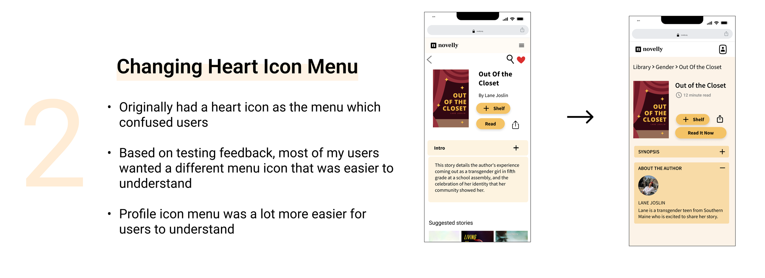

D E S I G N + T E S T I N GI brought in the visual design and UI aspects to finish everything off and make it more appealing. I used the brand’s design style guide which included font types, and colors. Incorporating images that fit well was also a big part of the process. we added the book cover images, as well as the author’s pictures. Also made a few changes to the heart and hamburger Icons based on user feedback.
P R O T O T Y PE C O N C L U S I O N—> A/B test on CTA verbiage: choose between different text for the review and community page & see which ones would get more clicks/engagement
—> Include customization features: the font size and background color could be customized so that users are able to choose the options they want while reading